Brand Guidelines
A comprehensive guide to the Klyra Labs visual identity system, including colors, typography, components, and usage guidelines.
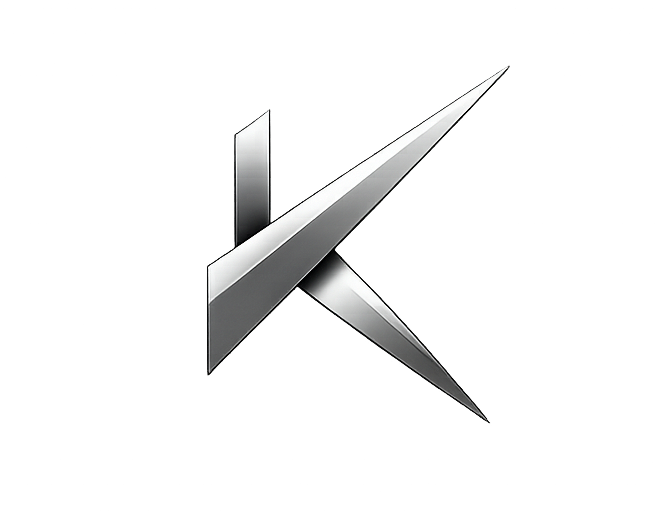
Logo Usage
The Klyra Labs logo is the primary identifier of our brand. Use it consistently across all platforms and materials.
Primary - Dark Background
Inverted - Light Background
Maintain clear space around the logo equal to the height of the "K" in Klyra. The minimum size for digital use is 40px in height to ensure legibility. For print, never go below 15mm in height.
Color Palette
Our color system is built on a foundation of deep, dark backgrounds with silver metallics and a sophisticated navy blue accent. This palette conveys security, premium quality, and technological sophistication.
Core Backgrounds
Silver / Metallic
Accent Colors
Status Colors
Text Colors
Gradient System
Our gradient system adds depth and premium feel to key interactive elements. Use gradients sparingly for maximum impact.
                    /* Metallic Gradient */

                    --gradient-metallic: linear-gradient(135deg, #F0F0F0 0%, #C8C8C8 25%, #E0E0E0 50%, #B0B0B0 75%, #D8D8D8 100%);


                    /* Animated Text Shimmer */

                    --gradient-text: linear-gradient(135deg, #FFFFFF 0%, #E0E0E0 25%, #6B8FC5 50%, #E0E0E0 75%, #FFFFFF 100%);
Type System
Our typography system uses three carefully selected font families to create hierarchy, convey technical precision, and maintain readability across all contexts.
Used for headings, titles, and key statements. Its geometric forms and open apertures convey modernity and technical sophistication.
Our monospace font reinforces the technical nature of our product. Use it for code snippets, terminal output, labels, tags, and metadata.
UI Components
Core UI components follow consistent patterns for styling, spacing, and interaction states.
                        /* Button Base */

                        padding: 16px 32px;

                        border-radius: 4px;

                        font-family: var(--font-mono);

                        font-size: 0.75rem;

                        text-transform: uppercase;

                        letter-spacing: 0.15em;
Glass Card Title
Cards use a semi-transparent background with backdrop blur to create depth. Hover to see the interaction state.
Feature Card
Use consistent padding (2rem) and border-radius (12px) across all card components for visual harmony.
                        /* Glass Card */

                        background: var(--bg-card);

                        backdrop-filter: blur(20px);

                        border: 1px solid var(--border-subtle);

                        border-radius: 12px;

                        padding: 2rem;
                        /* Form Input */

                        background: var(--bg-tertiary);

                        border: 1px solid var(--border-subtle);

                        border-radius: 6px;

                        padding: 12px 14px;

                        color: var(--text-primary);
Spacing System
Consistent spacing creates visual rhythm and hierarchy. Our spacing scale is based on a 4px base unit.
                        --section-padding: 120px; /* Desktop */

                        --section-padding: 80px; /* Tablet */

                        --section-padding: 60px; /* Mobile */

                        --container-max: 1200px;
Animation & Timing
Motion brings our interface to life. Use animations purposefully to guide attention and provide feedback.
                        --transition-fast: 0.2s ease; /* Hover states */

                        --transition-medium: 0.3s ease; /* Component transitions */

                        --transition-slow: 0.6s cubic-bezier(0.16, 1, 0.3, 1); /* Page transitions */
Breakpoints
Our responsive system ensures a consistent experience across all devices.
                        /* Desktop - Default */

                        max-width: none;


                        /* Large Tablet */

                        @media (max-width: 1200px)


                        /* Tablet */

                        @media (max-width: 1024px)


                        /* Mobile */

                        @media (max-width: 768px)


                        /* Small Mobile */

                        @media (max-width: 480px)
Brand Voice
How we communicate is as important as what we say. Our voice reflects our values of security, sovereignty, and technical excellence.
Authoritative
We speak with confidence and expertise. We are the leaders in private AI infrastructure.
Clear
Complex technology, simple language. We avoid jargon and explain concepts accessibly.
Empowering
We put control back in the hands of our users. "Own Your Intelligence" is our mantra.
Professional
Enterprise-grade solutions deserve enterprise-grade communication. We are serious about security.